SMMART ART:
Robert Delaunay
"The French painter Robert Delaunay began his artistic career as an apprentice to a stage designer in 1902. In 1904, he turned to painting, initially in the style of Impressionism, but soon moved away from more traditional practices in order to explore the abstract qualities of colour. By 1905 he was painting in large patches of bright colour in the manner of the Fauves. During the period 1908-10, he made his own contribution to Analytical Cubism by producing Cubist-style works with vivid colours instead of the fashionable browns and greys of Picasso (1881-1973) and Braque (1882-1963). His subjects also differed: he chose dynamic urban imagery rather than the more conventional but static still-life forms. This is exemplified in his series of pictures of the Eiffel Tower, such as The Eiffel Tower and The Red Tower (1912).
Delaunay's style at this time featured loosely painted patches of rainbow colours laid out in overlapping planes of contrasting or complementary hues, which the art critic Guillaume Apollinaire (1880-1918) interpreted as having a 'musical effect' and dubbed it Orphism or Orphic Cubism. (Orpheus was a mythological musician of ancient Greece.)" (www.visual-arts-cork.com)
"Aprons on" for our formal art class... in the style of Robert Delaunay's Orphism. We tried some different techniques. The first technique aimed to replicate his "The Eiffel Tower".
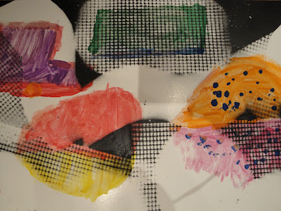
Each child was given a half piece of poster paper. Then they were told to lay a smaller piece of paper on the posterboard and paint a building so that only half of the building showed up on the posterboard. The smaller paper helped to create a stark line of nothingness and only half the building. Then the artist continued to paint the other half of the building on the posterboard, but so it didn't quite line up. Some children painted buildings, others painted half-shapes and half-objects. This is how we attempted Robert Delaunay's Orphism technique.
After the posterboard painting was dry, we went outside and laid cut out shapes on top of the pictures. Some shapes were cut from cardstock and some were cut from shelf liner (it has teeny holes- you can pick up a roll at the dollar store). We spray painted black on top of the shapes that were laying on top of the artwork. When the shapes were removed, there were patches of black, spotted black from the shelf liner, and patches of white where the original artwork showed through.
My favorite piece of artwork was of Rapunzel's Tower. Half of the posterboard was left blank and the shelf-liner paper was placed in the blank area. The end result showed Rapunzel's tower with lanterns floating in the night sky. Very creative!


No comments:
Post a Comment